CASE STUDY: Advertising in Taiwan, SOARTEC
In Taiwan, there are many companies with extraordinary products, but for certain reasons, they do not have access to communication agencies that can understand their business and give them a brand image that can lead to success outside the island.
One of the main reasons is that in Asia there is a shortage of agencies that know and understand the global market, there are no agencies with decades of experience in America and Europe and that also operate in Asia and the agencies that operate in this market are extremely expensive.
For these and other reasons, not all companies in Taiwan have access to this type of service, due to the high costs of renowned international agencies, large commissions, and high prices for their services.
The key to helping these companies is knowing how to offer personalized services according to the needs of each client, as is the following case study of the company SOARTEC located in Taichung.
When I accidentally contacted this company, they had the need to reach the global market with an image that faithfully represents their company and its products, an image that could project the quality of the products they make, taking care of even the smallest detail.
The products they offer to the market have certifications and are made with great detail, they also offer a wide range of products, a range of possibilities where to choose the one that best suits the needs of each client.
When I contacted them, they needed a change in their brand image to run a campaign in a specialized magazine of the sector but they were not happy with the services that their previous provider offered them. Coincidentally, I was in Taichung at the time, so I was able to offer my services despite not understanding a single word of Chinese at the time.
Through the person who contacted us, I only needed to ask a few questions to find out what approach he was going to take to the campaign. Really when you work with great quality products it is much easier to put them in a frame and sell them.
There were various data that gave me the key to the visual concept, but the product specifications made it very clear to me how to approach the strategic concept.
SOARTEC tools are:
- Small
- Light
- Strong
- They have CE certification
- Made in Taiwan
With respect to the competition, these are great advantages that I considered important to communicate to consumers. Previously, the approach was to show the entire range of the company's products in such a small space that it was impossible to pay attention to something specific, the visual strategy was not attractive nor did it generate an aspiring brand image for the international market, it was like entering a china shop messy full of gadgets.
To give the brand an image that would improve its branding and help them enter the global market, I opted for something much more minimalist, a new way of explaining the benefits of the brand but in addition to positioning it in the market as I explain in my article previous "How to make branding?".
I prepared 3 different options as we always do at IGNITE:
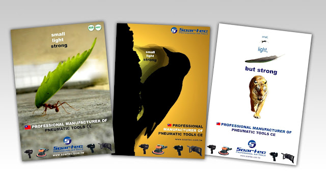
1 - The first option was to opt for an image of an ant carrying a leaf, ants are small, light, and very strong, being able to lift up to 50 times their own weight. Again the simile of ants helped me explain a concept as I did with SAP to win the direct marketing account for Spain. Human beings are attracted to nature and its forms.
All this accompanied by a minimalist, clear and concise copy: "Small, light, strong" that perfectly defined the product.
I also wanted to add a Taiwanese flag as a differentiating symbol that would give high-quality products, and help to differentiate themselves from products made in the People's Republic of China, which although their reputation is gradually changing, has a very bad reputation for being considered as short duration due to its poor quality. This is why it was essential to differentiate yourself from your competitors in the PRC.
Another element that I considered interesting to include was the European Community certification logo, which adds value to the products, given the technical requirements in terms of quality and compliance with regulations to obtain this type of certificate.
And finally, we add a "call to action" including the web address inviting the user to interact and contact the company, being able to see in-depth more information about all Soartec products.
2 - In the three posters we use practically the same common elements, but in this second version, I wanted to illustrate the visual concept by means of a woodpecker that shares the three specifications "Small, light, strong".
In addition, a movement effect was added to make it more dynamic and an orange color emulating a sunset using an emotional psychological strategy of nostalgia to awaken empathy in the consumer towards our products and our brand.
3 - Finally, the visual strategy for the last proposal followed the same principles as the previous two making use of elements of nature, such as an ant, a feather, and a tiger, making reference to the three concepts of the copy: "Small, light, strong ".
In this case, a differentiating white background was chosen, since the medium for which this campaign was intended was saturated with products and advertising messages.
Finally, the managers chose the first option, which was used to advertise SOARTEC in the specialized magazine. In addition, the image was used to make posters that covered the walls at the company's stand at the fairs where it was present and as support on the company's website.
This is an example of how IGNITE can help local companies in Taiwan to position themselves in the global market with a robust image thanks to well-done branding. They are differentiating keys that are helping us to increase sales and improve our relationship with customers from other continents.
Our offer is not based on promises, our offer is based on real success stories.
In IGNITE Global Marketing we can help you, GREAT ideas can do WONDERS


